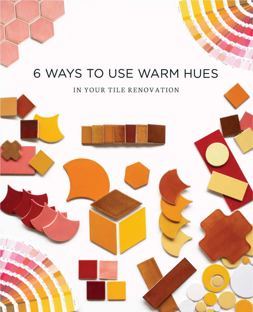
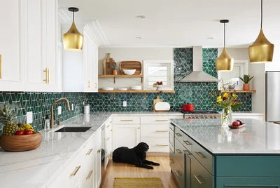
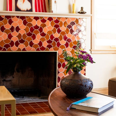
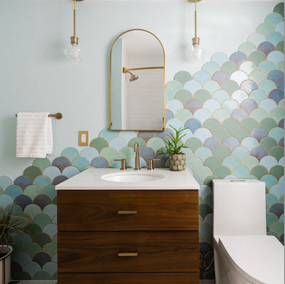
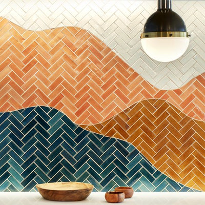
Warm colors are known for evoking feelings of happiness, optimism and energy. We want to break the taboo that warm hues are meant for summer, because who doesn’t want to spread happiness year round? It’s no secret that we love deep hues of blue and cool shades of green but we have a special place in our hearts for a warm color palette consisting of dynamic reds, energetic oranges, and bright yellows. Here are 6 ways to use warm hues in your tile renovation...
1. Bright Yellows
Yellow represents freshness, happiness, and positivity. Our yellow color palette is a burst of sunshine in any setting.
 2"x2" - 24 Dandelion, 51 Marigold, 1030 Cornmeal, 3W Lemon
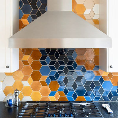
We love it when businesses embrace color and The Bachelor Farmer Café is no exception. This delicious Minneapolis staple welcomes a bright and bold color palette. As much as we love yellow, we understand that it can also be distracting when used excessively. That’s why we suggest pops of yellow. Adding pops of yellow hues gives excitement to the overall design by mixing cool and warm tones. Get the full scoop on The Bachelor Farmer project in our blog “Behind the Bachelor Farmer Café Tile”

 Large Diamonds – 60 Silver Lining, 45R My Blue Heaven, 11 Deco White, 24 Dandelion, 18 Bright Blue, 366 Satin Black
Photos: @jameslylephoto @rvkowlessar @fatherpetemisty @onasugardiet
2. Vivid Oranges
The ultimate extrovert color – orange! Orange is the color of joy and enthusiasm. Our orange color palette is ideal for a bold, Mid-Century Modern look.

2"x2" - 1023 Butter Toffee, 68 Vivid Orange, 16 Harvest Orange, 1072 Baroque Gold, 51 Marigold
Our Northeast Minneapolis neighbors, Chowgirls Killer Catering wanted a bold look for their new company headquarters. And since we use any excuse to incorporate color into our tile, we were more than happy to oblige. Drawing inspiration from their sustainable standards, this project needed to reflect their values that drive their killer catering business. We landed on an orange-hued hexagon wall inspired by honeycomb. When choosing tile color, don’t be afraid to make a statement. Chowgirls Killer Catering is the quintessential example of how warm hues can add so much personality and charm to a space.
 Large Hexagons – 1950E Indian Summer, 1950W Indian Summer
Photo - Lauren B
3. Burnt Oranges
Burnt colors are known for evoking comfort and affection. Our burnt hue palette is the perfect way to bring a natural element to your home.

2"x2" - 1047 Roasted Pepper, 906W Burnt Sugar, 112 Saddle Clove, 65W Amber, 132 Jewel Brown.
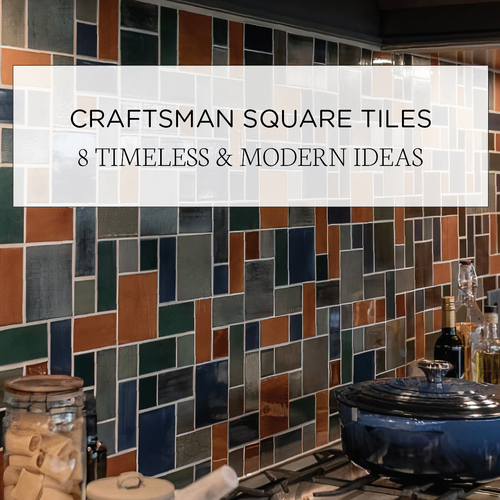
For those with earthy spirits, this burnt hue color palette is ideal for a welcoming environment with casual elegance. From terra-cotta floors to caramel farmhouse backsplashes, these cozy colors are timeless and trendy. When it comes to burnt orange hues, we recommend Craftsman Squares. Inspired by natural materials and rustic landscapes, our Large Craftsman Squares will add comfort and warmth to any space.
 Large Craftsman Squares - 112 Saddle Clove
4. Bright Reds
Daring and bold, bright reds demand attention. It’s a staple accent color that brings vibrancy and stimulation.
 2"x2" - 1206 Neon Red, 372 Red Velvet, 928 Oxblood, 58 Brick Red.
Bright reds are powerful and invigorating when used with care. Some of our favorite contemporary spaces mix vibrant reds with cooler tones to give the finished look a depth that is unmatched. Using more than one glaze color balances each color to give it an overall appealing look. We believe in giving our customers creative freedom when it comes to choosing glaze colors regardless of their budget. We want our customers to love their tile renovation and not feel limited due to pricing. That's why there's no additional cost for adding colors to your design! Check out our full color palette to get the inspiration flowing!
 3"x8" Subway - 906W Burnt Sugar, 372 Red Velvet, 713 Peacock Green, 18 Bright Blue, 60 Silver Lining.
Photo - Kor Interior Design
5. Rustic Reds
Rustic reds are deep hues of reddish browns - think burgundy, umber, and rust. Our palette of earthen reds is inviting and sophisticated.

2"x2" - 104 Fireluster, 1047 Roasted Pepper, 1673 Espresso, 65R Amber.
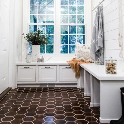
While bright hues of red are invigorating, subdued shades are sophisticated. Rustic reds draw attention without being overwhelming. With these deep warm hues, more is always more. We love a hexagon floor to show off this deep red color palette. With subtle variation and rich depth, enter your home in style. Check out more on this Mid-Century Modern Mudroom in our blog "Tile Home Tour: Newly Remodeled Mid-Century Home."
 Large Hexagons - 1673 Espresso.
Photo - Chelsie Lopez Productions
6. Pretty Pinks
Last but certainly not least – pinks! With Living Coral being Pantone’s color of the year, it’s no surprise that pink is showing up everywhere in the design world.
 2"x2" - 309E Grapefruit, 1083 Honeysuckle.
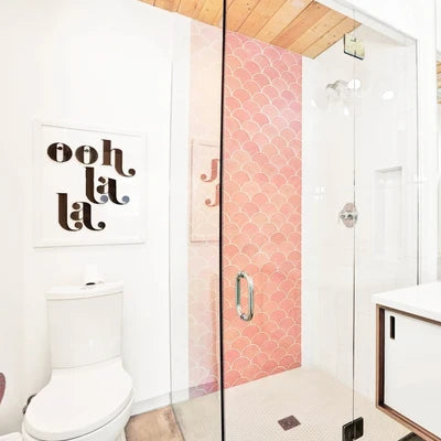
Create an unforgettable ambiance with soft pink hues like Fox Homes did with our pink Moroccan Fish Scales. When using a unique color, such as pink, you can open up and transform any room of your house. Head over to our blog "Use Pantone's Color of the Year with Grapefruit Glaze" to browse different ways to use our pink-hued tile.
 Large Moroccan Fish Scales - 309E Grapefruit.
Photo: @Foxhomesmn
Order tile samples to see, touch, and fall in love with our handmade tiles in person. We would also love to hear what inspires you! Tell us more about your future project and get the ball rolling.
The post 6 Ways to Use Warm Hues in Your Tile Renovation appeared first on Artisan Tile Company: Handmade Ceramic Tiles by Mercury Mosaics.


