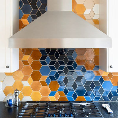
This blog, Color Stylings with Mercedes Austin, was originally written for Shelfology. Check it out here!
Fresh Founder Intro
First, a new introduction is in order – I haven’t shared on our blog on the topic of color and design related to products in quite some time. I’ve been on the business end of so many things for good reason. It has been over the last few years that I’ve tapped back into the why of starting Mercury Mosaics in the first place that has really invited me back to the product development side of the business.
So, if you’re new here – hello! If you’ve been here awhile, thank you for being here. I’m Mercedes Austin – born an artist and color loving misfit from day one. I grew up in a Victorian home located in South Minneapolis’ Central neighborhood – the same place Prince went to high school. My house was adorned with the interior stylings of a rebellious artist and the architectural bones of a master builder from the 1800’s. Imagine exquisite stained glass windows, original turn of the century lighting and ornate custom millwork with details you just don’t see that often. My childhood room was filled with bright red & orange hexagon wallpaper sprinkled with uniquely illustrated animals within the geometry. The boldest colors you can imagine juxtaposed with vintage pieces of furniture covered in high gloss paint all surrounded by architecture with so many stories to tell.
I fondly remember being a toddler talking to the animals on my walls in their hexagon homes. A love of shapes started early from the design around me and the things I found comfort in as a kid. My imagination was bursting with energy since the beginning. Later in life, my rebellious artist mom started playing by the rules and the bold colored wallpaper and high lacquered vintage furniture would slowly but surely exit our home for a traditional Victorian look. By this time, because of being a teenager, I’d lost any interest in being at home for any length of time, so I would always be on the move, learning something new. I was one of the only kids I knew without a curfew or who had to check in. I had full freedom to explore & socialize – my mom implicitly trusted me. It was in these teenage years that I would discover ceramics and start to think of myself as more than an artist. I became intensely interested in building and making things.
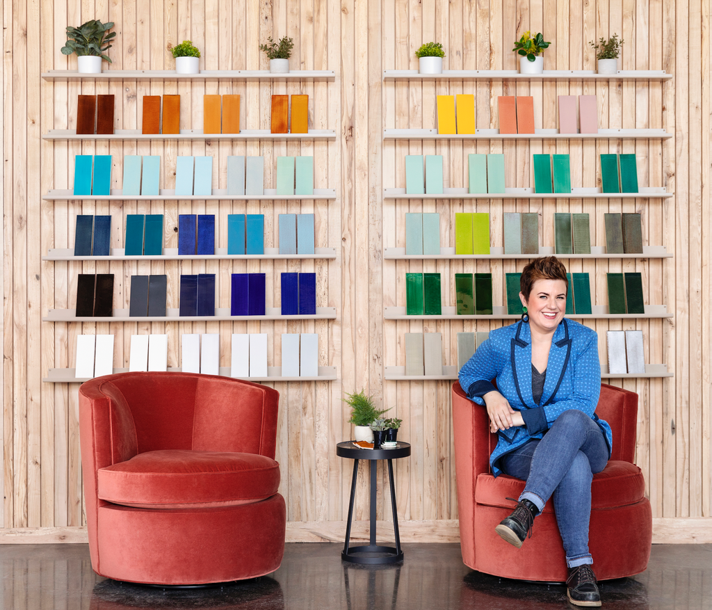 Mercedes Austin, 2023.
Photography by Artful Living.
Fast Forward to Today
I picked up on what I love to make, turned it into a day job and later grew that into an industrial version of an artist’s studio where dozens of artisans bring geometric patterns to life through our process. The style that I did the thing was very steady, extremely bootstrapped and went through about 5 business models to land where we are now – it’s that classic if at first you don’t succeed, try-try-again approach. It’s also where my personal motto: “Never Give Up” comes from. I remind myself of this & many other things frequently.
The style that Mercury creates tile adopts the artist rebel I greatly admired in my mom in the way we work and how we show up in the tile industry. The fun part about it is there are more of us out in the market. It was lonely for a bit in our first 15 years of business, but now that the industry has adopted colorful ceramic tile as normal versus something you see here and there, we’ve got a lot more members of this budding maker-led community that is building at scale. At Mercury Mosaics, we’re a fusion of industrial designers, creative rebels, sustainable champions, and ceramicists through an ongoing learning, building & making process.
 Mercedes Austin, 2023.
Photography by Artful Living.
The Birth of Vibes
Never underestimate what you’re inspired by. I also remind myself of this on a constant basis, it can be easy to forget. We’ve been building an online shopping experience for our handmade tile diligently since 2018. While our website still doesn’t have everything we make, it is certainly filled with our most popular creations. In the last 4 months we’ve been working on a new way to curate these beautiful selections for you. I like to think of myself as a data nerd, because in building this creative enterprise, I’ve taken on the role of data analyst to understand our customer trends so we can constantly work to facilitate them. Based on our most recent findings, we decided it would be helpful to organize our varying offerings into ‘vibes’.
When you’ve poured so much time and investment into a space, tile can really polish the look. The perfect combination of colors, materials and hues set the mood and have the power to transform any space. A place that may be just a room to becoming somewhere you enjoy spending your time recharging, connecting and being with people you truly care about. I highly recommend paying attention and learning for yourself what speaks to you and embracing it. What would your life look like if your spaces reflected you? Without further ado, here are the five vibes we’ve curated.
Dark and Moody
I’m here for Dark & Moody, the depth and character this adds to an interior is nothing short of soulful and timeless. We’ve curated a mix that’s strong, grounding and elevated. In my early career I was warned about using color in general. For fellow rebels and me – you know what’ll happen if you tell us not to do something – we’ll do it any way. I’m a firm believer in using things that work against a vision I have in a positive light, and I like to call it upcycling the naysayers. Wildly, when things come to life in the mainstream, those same people telling you that color depresses the resale value of homes are the ones later interviewing you for the trends and listing you off as an amenity. My point here is there are so many opinions out there. You have to have a strong sense of direction and be relentless to make it happen. We have been designing with deep moody colors in spaces that have strategic pops of color in the form of most often hardware, lighting, and even wallpaper.

Left: Medium Moroccan Fish Scales - Onyx Blend
Right: 2”x6” Subway Tile, Stacked & Herringbone: Onyx Blend - 366 Satin Black, 613 Black. Photography by Sage E Imagery, Styling by Creekwood Hill
Organic Modern
In the world of tile design, we find the Organic Modern style, a breathtaking fusion that seamlessly marries the sleek simplicity of modern aesthetics with the captivating allure of nature’s beauty. It’s a harmonious blend that transcends boundaries and creates a captivating visual tapestry.
Terra cottas and greens are showing up in droves in our tile making studios. I’m surprised these tones weren’t commanding attention ten years ago, but if there’s one thing I am – it’s patient. I mean, imagine you’re hiking tree-filled mountains with the freshest air, where you recharge and become centered. (I’m speaking to my non city friends here) This feeling of being at one with mother nature is something so many of us are searching for in our interior spaces. At the very least, we’ve brought in and kept alive a number of house plants, and this is taking that feel to the next level. We’re talking a more permanent building material-level. It’s not unusual to hear our clients seeking emerald tones harkening an exploratory trip filled with epic treks or simply a reminder of a yurt they’d just recently Airbnb’d at for the weekend. Color tells a story and curated intentionally, it can tell you a story you’d enjoy reading and rereading on a daily basis. Earth tones are absolutely colors, which are trending now, but have proven to be timeless across genres – so don’t worry as much about being on trend and continue investing time in learning which hues fill you with happiness.
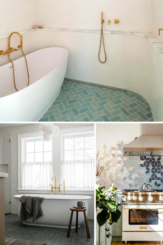
Top: 3"x6" Subway Tile - 214 Coastal Breeze. Architectural Design by Bowerbird Architects, Photography by Matthew Williams
Left: 4"x4" & 2”x4” Subway Tile - 912W Cloudy Sky, Interior Design by Yond Interiors, Photography by Amanda Birnie
Right: Medium Diamonds - 301 Marshmallow, 815W Light Grey, 912W Cloudy Sky, 214 Coastal Breeze, 22E Blue Opal, Custom Colors. Interior Design by Heartbeet Kitchen, Styling by @Creekwoodhill & @francois_et_moi, Installation by @bcherney, Photography by @Sageeimagery
Hipstoric Style
When working with handmade tile, the past has never been livelier. The hipstoric home style blends elements of contemporary and historic design. Hipstoric spaces are rooted in the past, timeless in appeal, and modern in sensibility. Our ceramic tile is just the same.
The hipstoric style in tile design has truly captured my imagination, and one standout feature that exemplifies this aesthetic is our Hexagon flower pattern. When it comes to crafting interiors with a touch of history, this pattern has been a game-changer. Its intricate geometric design draws inspiration from classic motifs, transporting any space into a bygone era while maintaining a contemporary edge. What truly sets it apart is the craftsmanship – the handmade tile not only evokes nostalgia but seamlessly integrates with the existing architecture of historic properties. It's as if it has always been an integral part of the design, breathing new life into these spaces while honoring their rich history.

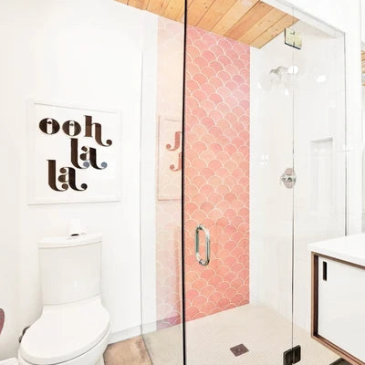
Top: 3"x6" Subway Tile, Chair Rails, and Cove Base - 11 Deco White, Victorian Pattern - 11 Deco White, 77E Grey, 123W Patina (Custom Color), Interior Design & Photography by Patti Wagner
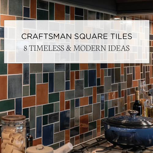
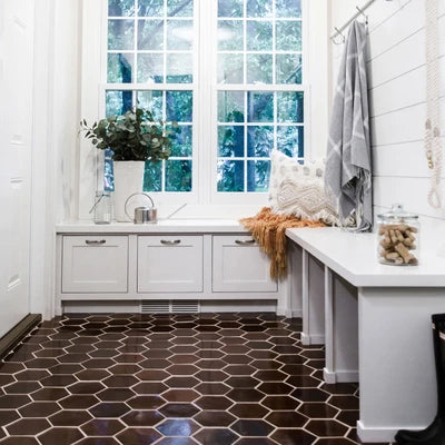
Left: Large Craftsman Squares - 920 Midnight Sky, 123R Patina, Custom Colors, Photography and Interior Design by Brownstone Boys
Right: Medium Moroccan Fish Scales - 12W Blue Bell, Architectural design by Bowerbird Architects, Photography by Matthew Williams
Nautical
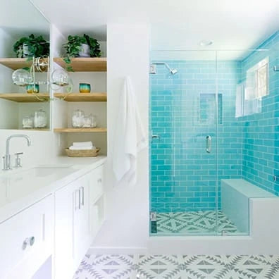
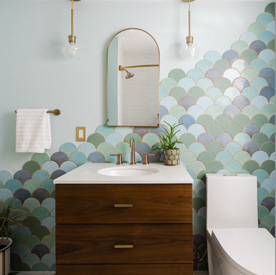
Want to bring the feeling of lush coastal landscapes and vibrant waterways into your interior? Natural ceramic tile with hand-painted glazes is the natural choice. This vibe is all about the lifestyle aquatic design or nautical style. Organic textures, signature shapes, and a thoughtful palette bring these nautical looks to life. It often includes the use of cool, soothing color palettes, aquatic motifs, and various types of tile patterns and textures to create a refreshing and tranquil ambiance. This design approach allows individuals to infuse their living spaces with a serene, watery vibe, reminiscent of the ocean or a peaceful lake, using the timeless appeal and durability our handmade tiles.
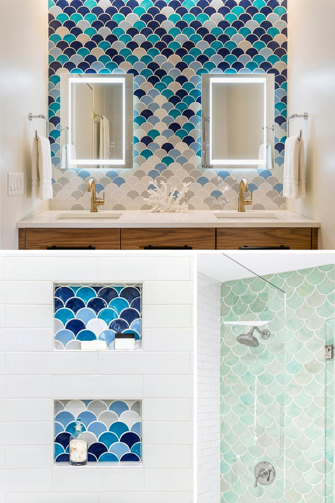 Top and Right: Medium Moroccan Fish Scales - 33 Vivid Blue, 1015E Caribbean Blue, Custom Color, 60 Silver Lining, 77E Grey. Photography by Andrea Rugg Photography, Design by Kate Roos Design.
Left: Large Moroccan Fish Scales - 214 Coastal Breeze.
Jewel Tones
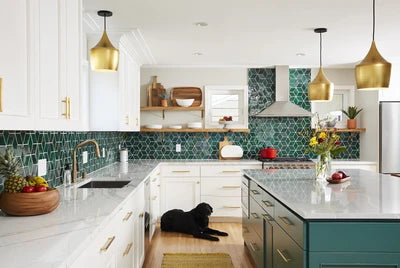
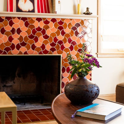
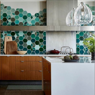
Jewel Toned Tile is a captivating design trend that brings the opulence and allure of precious gemstone colors into interior spaces. This sumptuous style is characterized by a deep and vibrant color palette inspired by gemstones like emeralds, sapphires, amethysts, and rubies. In this design trend, jewel-toned tiles play a pivotal role in creating a lavish and luxurious atmosphere. Whether used for flooring, walls, backsplashes, or accents, they add a touch of elegance and drama to any space. The intense and saturated hues used in this style exude a sense of luxury, making it a popular choice for those who wish to make a bold and visually stunning design statement.
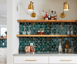
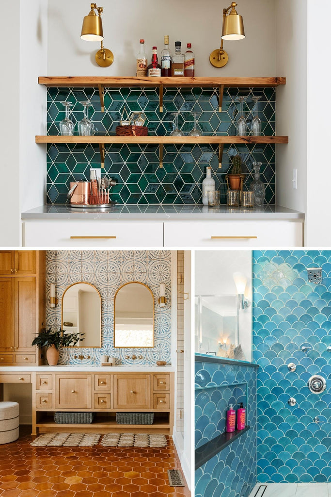 Top: Medium Diamonds - 75 Emerald, Interior Design Emily Pueringer and Quality Cut Design, Photography by Alyssa Lee Photography
Left: Large Hexagons - 96 Chestnut, Interior Design by Emily Pueringer, Photography by Rubinksi Works, Installation by Quality Cut Design Remodel
Right: Large Moroccan Fish Scales - 1015E Caribbean Blue, Remodeling, Install & Photography by JJ Kokesh & Son Inc.
Order tile samples to see, touch, and fall in love with our handmade tiles in person. We would also love to hear what inspires you! Tell us more about your future project and get the ball rolling.


