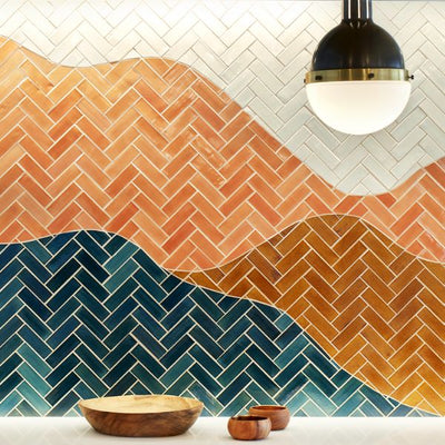
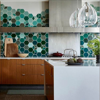
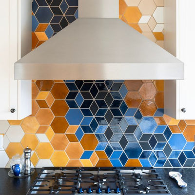
Our Design Studio kitchenette has gone through several iterations, evolving into a space that truly captures the spirit of Mercury Mosaics and our dedication to our craft. If you’re new to our Design Studio journey, you can get the background here: The Why Behind our Design Studio.
From the get-go we knew the kitchenette needed to support multiple functions, making it a true design challenge. We didn’t want it to feel like your typical office kitchenette, which is exactly how it started. I initially approached our design studio with a minimalist mindset, but it increasingly became clear that this space needed to drive our cutting-edge operational strategy: In order to produce top-quality, one-of-a-kind products, we would have to create a space for specialized artisans that had sufficient resources and state-of-the-art equipment.
It was critical that every room of the design studio reflected the caliber of our strategic goals––even the kitchenette.
We also wanted to establish a brick-and-mortar office and showroom facility to provide front-of-house services to local clients and employees. This would give us a place for planning, strategizing and personal customer care. Knowing how critical this was to the design, we knew we’d have to spice up the vanilla template given to us by the landlord.


Keeping in mind our strategic goals, we wanted a kitchenette that felt both residential and professional – it needed to be comfortable yet suitable for commercial use. We were also craving something that hadn’t been done before, which meant we put a lot of pressure on ourselves for how’d we design the backsplash.
It was important to us that we had plenty of display space for our artistic tile concepts as well as enough storage space for everyday use. With my back against the wall (figuratively), I was unable to solve this unique design puzzle, so I immediately turned to Morgan Molitor at construction2style. Morgan was audacious enough to get me to relocate the kitchenette right away. Her top three reasons were:
- Flow of space
- Future event hosting
- Creating a better focal point for tile
This updated direction made a lot more sense for all the above points.
Here’s the adjusted layout:

We brought the second iteration to life with renderings:

The renderings allowed me to see the versatility of the cafeteria-style tables, while the newly configured kitchenette and concept boards made so much more sense to me than the original design.
If the layout is like the room’s skeleton, the color is like the soul. That was the next piece in solving this kitchenette puzzle: The room needed some soul.
My design family at c2s developed this mood board to help set the tone:

Mood boards have been such an important tool throughout this entire design process. Pinterest does a fantastic job of being a place where you can gather what you’re attracted to, helping you convey your vision more concisely to a designer. While mood boards can be messy, you have the flexibility to update them over and over again – way more affordable than updating actual furniture and walls!
In the next chapter of our design journey, we focused on cabinets and tile design. We played with the following concepts:

However something was still missing; this would be the next design challenge. I always tell our clients that you know you’ve found the right design when you stop thinking about it. With these designs, I was still thinking too much. The backsplashes themselves were excellent, but they weren’t quite right within the overall space. I was even smitten with the cabinetry arch. But the vintage, industrial features of this historic space – with some of the original cranes cradling the ceiling – needed a tile that complemented the room’s high ceilings and historic character. At this juncture I knew it was time to take a few steps back and continue collaborating within my community.
Confidence is an extremely important factor when you’re designing a space, and there is a lot of trust between Morgan, Kayla and myself. Collectively we understand that smart design isn’t something you whip out in three easy steps; it involves several perspectives. We opted to bring in William Dohman from Dohmicile to take in all the selections we made, listen to our needs, and help us understand where we could be flexible with our final design. The path we took would embrace “resimercial” design.
“It is suggested that building professionals should turn to the residential sphere for guidance in shaping the innovation-driven workplace of today. Studies show there are specific design components and behaviors common to residential environments that have been found to foster creative thinking. Resimercial Design is the new path to workplace creativity.”
I’m here for it. In fact, it makes so much sense to me, I recommitted myself to pushing through the perceived boundaries to bring this space to life in a way that would establish a physical representation of…
- Team Commitment
- Design Innovation
- Hybrid Work Environments
- The Importance of Art
The updated kitchenette plan includes two working islands, as well as a ledge along the front windows for more flexible working space:

Dohmicile’s ingenius renderings beautifully combined the bones of Morgan’s layout with the look-and-feel of Kayla’s selections, giving us a blank canvas to dream up tile possibilities:


I was extremely inspired at this point, but we’d reached a place where I felt too close to the project. As familiar as I was with all sorts of backsplash ideas, my creative willpower to solve the backsplash fell out the window. I’d been so involved with construction operations, the nitty-gritty of brand partnerships, the magic of making the budget work, and directing the behind-the-scenes project management, that my well was empty when it came time to finalize the backsplash.
I just knew I wanted a warm color palette and my original selections weren't doing it for me. Luckily, I have some of the most talented creatives on my team and they were most definitely up for the challenge.
I decided to fully immerse myself into the client experience and, honestly, this was the first time I was taken through our custom tile design process as the client – fumbling to get the correct dimensions and all. I felt even more connected to the patience and kindness we bring to each project. I literally felt like a kid in a candy shop. My team never pressured me to make a decision. Something I thought I needed the weekend to think about would end up taking another five days. I wanted to be really clear on the final decision with no regrets.
I narrowed the five options below to three final options, plugging them into renderings.


These were the final 3 options in our renderings:
Option 1:

Option 2:

Option 5:

And the winning backsplash concept is Option 1 which includes two new glazes:
205 Cider + 54 Dusty Rose. We added in the last detail to the renderings: the stain for the maple lower cabinets is called Spice Walnut. The paint for the Islands is by our friends over at Clare Paint called Current Mood.
A successful renovation requires the right blend of intentionality, personality, and ingenuity. A thoughtless design takes the same amount of materials and labor, so you might as well start with a forward-thinking plan that will serve you for years to come. That’s what our customers are looking for when they invest in handmade tile, and I needed to adopt a similar frame of mind in approaching our Design Studio.
I can’t wait to show you the end results. Follow us to keep up to date and maybe someday soon we’ll see you at our studio in person.


