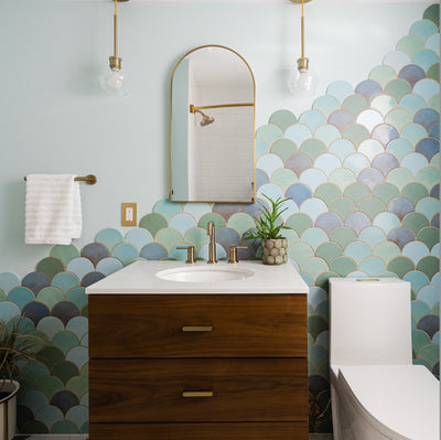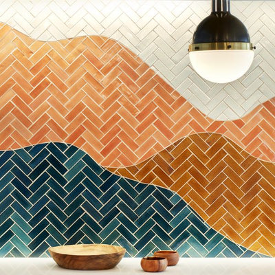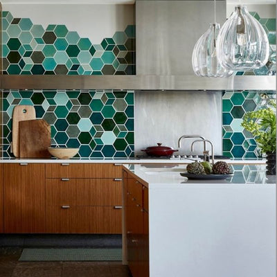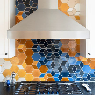
Past showroom sample wall inspiration
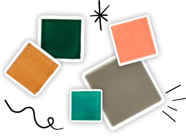
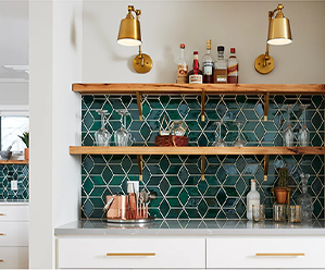
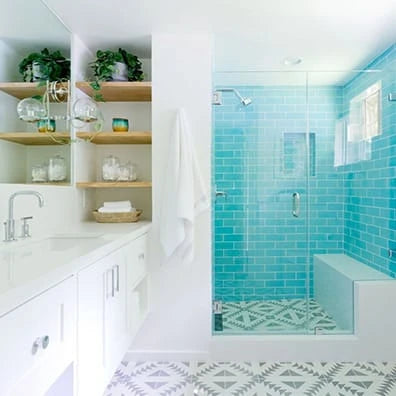
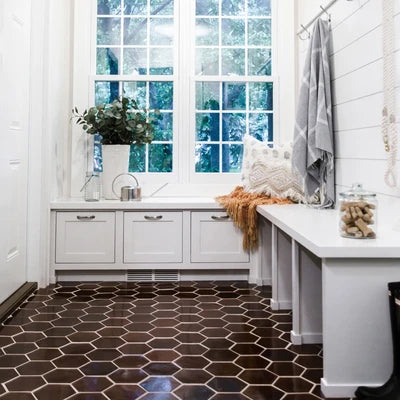
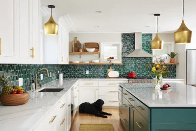
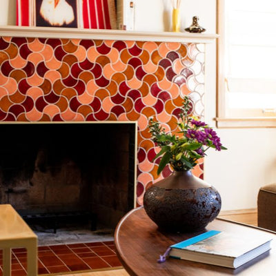
The “wall of color” that held our entire color palette was a signature focal point of our previous showroom. Color samples were not only accessible, but beautifully displayed. Seeing as the “wall of color” was a leading inspiration for the updated design studio, there was a lot of pressure on the final execution. In my mind, I was set on the Fat Lippie shelves: the steel aesthetic was a perfect match for the space. But it required a warm backdrop to counterbalance the cool steel. This image inspired the revelation:

Shelfology inspiration
 Rendering by Dohmicile
Once the design direction was locked in, construction2style began introducing us to key brand partners to bring the overall vision to life. This really balanced me out. I’m a big picture, key details type of person. Morgan and her team held my hand throughout this entire journey. With the space programming, a landlord-provided fit plan, mood boards and key pieces of inspiration all in place, it was time to design a bespoke sample wall.
William at Dohmicile crafted what we have today with all the design elements included.
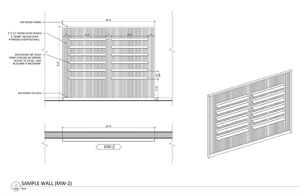
Elevation by Dohmicile
For the lumber, we partnered with a fellow female-founded manufacturer, Sarah Londerville, of Manomin Resawn Timbers. Using reclaimed wood, her materials add a century's-worth of character. The juxtaposition of the clean steel alongside the reclaimed wood anchors that sense of history, which reflects the traditional craftsmanship of our tile.


There’s so much character: Not only in our tile, but simply in the construction of the space’s vanilla-hued build-out. We’ve repurposed a historic gem that once housed a military manufacturer at the turn of the 20th century, adding sprinkles of spunk, a lot of elbow grease and gallons of coffee to imbue new life into the architecture. There are a lot of stories behind these walls, with craftspeople at every turn.
For our colorful entry, we layer your senses with various textures. Natural wood, cool steel, soft fabric, and glistening tile – all appealing to all your senses. Because of space’s assertive industrial nature and vintage-modern vibe, we landed on Shelfology’s signature Fat Lippie Picture Ledge. I ultimately strayed from our rendering, with the team recommending the “cowabunga” finish to make the tile pop more. That was the driving goal, after all. I couldn’t be happier!
Throughout our very own manufacturing process, we’re fanatical about details so it’s no wonder that the color-matching mounting fasteners included with these gorgeous, 10-gauge American steel gives me all the feels. The synergy between the Manomin Reclaimed Antique Ash Lumber, our handmade ceramic tile, and the Shelfology Signature Fat Lippie Picture Ledges made of steel creates a symphony of beautiful design.
Again, seeing that the “wall of color” was so foundational to our original showroom, there was a lot of pressure to make this new one just as incredible. In 2022, we’ve mastered the art of simplifying and that includes not having every shape, every color, stacked and stacked on every shelf. This edited wall is a beacon to our commitment to great artistry, first and foremost, and the drive to refine the operations of our craft. Now, when you enter our Design Studio, you’ll be greeted by this wall of color – and perhaps even a friendly designer!


