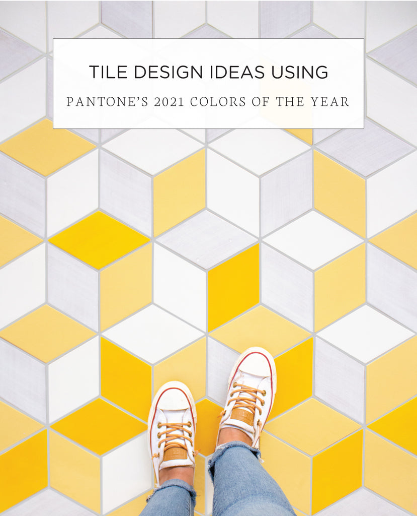
Every year the Pantone Color Institute releases its Color of the Year to represent the general tone of the world, and this year is no different. The ballots are in and they chose 2 colors this year to acknowledge the greyness of 2020 with “Ultimate Grey” and the light at the end of this long and crazy tunnel, with “Illuminating”.
While these two colors can be used together, the point of these very different hues is meant to have each stand on its own as a complementary tone for the other, thus supported each other. As Pantone puts it, this pairing is “A marriage of color conveying a message of strength and hopefulness that is both enduring and uplifting”. Continue reading to see some exciting ways to use these two hues with handmade tile!
Ultimate Grey
Grey tones are a common neutral palette for any space. While the color grey is known for symbolizing neutrality and balance it can also represent dullness. We like to think that by highlighting the textures and variations of our grey glazes that it transforms into an exciting hue rather than a dull one. By creating clean and soft spaces with differing shades of grey, our handmade tile can make any space feel like home!
For more neutral glaze palettes, visit our blog "Neutral Ombre Tile Ideas for Your Home"

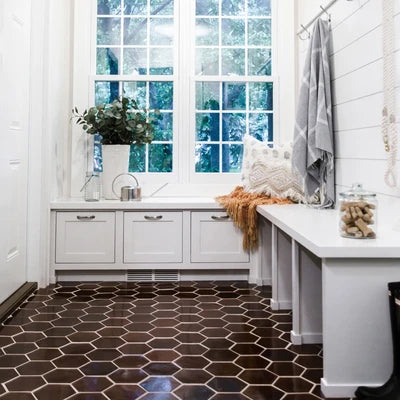
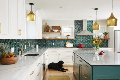
Top Left: 3"x3" Subway Tile - 220 Sooty Grey.
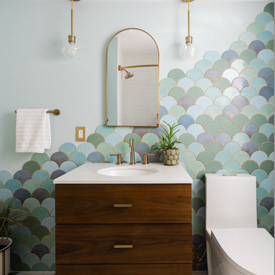
Top Right: Large Moroccan Fish Scales - 39 London Fog. Photography: Jacob Snavely Photography.
Middle Left: Stacked 1x3's - 11 Deco White, 130 White, 77E Grey Photography: Creekwood Hill
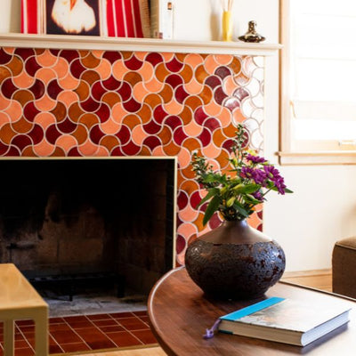
Middle Right: Medium Diamonds - 130 White, 11 Deco White, 77E Grey, 60 Silver Lining, 155 Steel, 366 Satin Black, 613 Black, 912W Cloudy Sky, 815W Light Grey.
Bottom: Small Hexagons - 815W Light Grey, 220 Sooty Grey, 912R Cloudy Sky.
Illuminating
It isn’t difficult to envision why Pantone chose “Illuminating” as the color that inspires hope during this time. Yellow classically evokes feelings of sunshine, warmth, and friendship. When used thoughtfully, yellow glazed tiles can be a soothing and smart choice to invigorate your space.
For more on warm-hued tile, visit our blog "6 Ways to Use Warm Hues in Your Next Tile Renovation"

A Marriage of Color
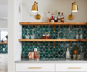
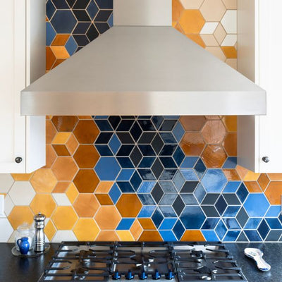
One of our most popular blends just happens to combine these two Pantone colors of 2021! Our mix tile Eichler Palms Blend adds a dimension of style through the strong color story and sleek lines of our cube diamond pattern. Using grey tones as a base color with yellow and blue as accents creates a balanced and modern design suitable for any space. We love mixing warm and cool hues together so these Pantone picks are right up our alley!
For more ways to mix cool and warm hues, visit our blog "How to Mix Warm and Cool Hues with Handmade Tile"

We love to hear what inspires you! Tell us more about your project for a free quote!
The post Tile Design Ideas Using Pantone's 2021 Colors of the Year appeared first on Artisan Tile Company: Handmade Ceramic Tiles by Mercury Mosaics.


