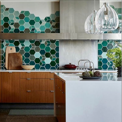
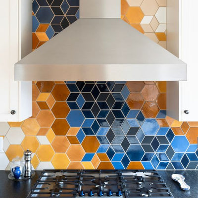
We're welcoming in the spring with complementary color combinations! Colors that are the opposite of each other on the color wheel are complementary. These colors have a strong contrast so they create a bright and beautiful look when used with our tile glazes. Here are 3 tile projects that we've made with complementary glazes and 3 complementary color palettes that we love and want to make in the future.
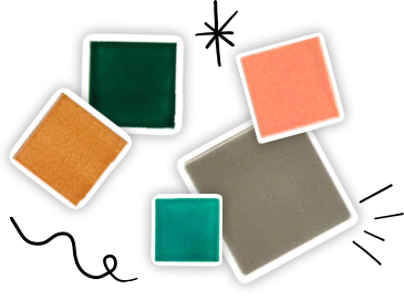
Here's a handy tile color wheel for you to use as reference:

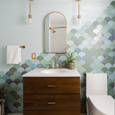
Tropical Moroccan Fish Scale Counter.
This Moroccan Fish Scale counter that we created for Fish Cheeks NYC is a taste of tropical tile heaven. The color combination here is known as a split complement, meaning there's a main color and two colors that are next to the immediate complementary color on the color wheel. In this example blue/green is the main color, marigold and rose are the split complementary colors because they sit next to the main complementary of red on the color wheel.

Large Moroccan Fish Scales - 244 Blue Green, 51 Marigold, 200 Red Wine.
Photo by Connie Zhou, from Fish Cheeks NYC Instagram.
Dusky & Romantic Tile Color Palette.
We love our newest color: 309 Grapefruit. It's actually so new that it's not on the website yet, but no worries, you can call in and get a sample or whole wall of this beautiful pink glaze. We muted down the complementary colors of pink and green to create a more romantic feel, adding in 366 Satin Black brings a sophisticated element to this color palette.

Medium Moroccan Fish Scales - Blue Opal 22E, 912W Cloudy Sky, 309 Grapefruit, 366 Satin Black.
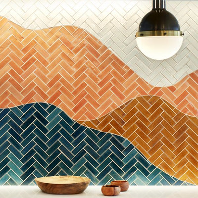
Modern Mountain Tile Statement Wall
What's better than a cup of coffee while looking at a mountain of handmade tile? This statement wall in Northern Coffeworks shows the beautiful pop of contrast that nature can inspire. There are a lot of colors in here including two complementary matches: red with green and orange with blue. When going with primary colors it can be helpful to add variations like we did with this project, so that it's bold without being too loud.

2"x4" Subway Tile - 15 Summer Sky, 45 My Blue Heaven, 1030 Cornmeal, 24 Dandelion, 51 Marigold, 16 Harvest Orange, 59 Red Hot, 1206 Neon Red, 47 Vermont Pine, 1036W Bluegrass, 958 Rainforest.
Photo by: Matt Hansen.
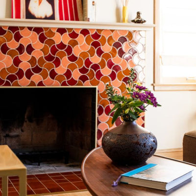
Royal Jewels Tile Color Palette
Our inspiration for this color palette came from a recently finished project: this purple Moroccan Fish Scale fireplace. We added 227 Celery for the yellow/green complementary color to the deep 1011 Royal Purple. Since this is a bright mixture, we added variations of the purple in more neutral tones to keep the look clean and cohesive.

Medium Moroccan Fish Scales - 227 Celery, 615 Purple Plum, 83 Tip Taupe, 815R Ash, 1011 Royal Purple.
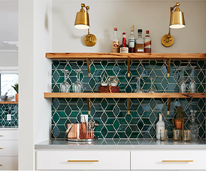
Bright Scandinavian Tiled Coffee Bar.
One of our most popular custom tile projects is right in our backyard at the Bachelor Farmer Cafe. The bold yellow and blue complementary colors in our Medium Diamonds create a stunning Scandinavian modern effect. We know this color palette has inspired many to go brighter with their handmade tile projects, we hope it does for you too. We have a very similar color range available on our tile shop, you can buy them online and they'll arrive at your home in easy-to-install sheets!

Photo by: Starlashay.
Moroccan Sunset Tile Color Palette.
1950E Indian Summer and 29E Lake Superior glazes look so beautiful together that we had to create a color palette from their complementary match. To create depth we added a deeper blue and to neutralize the contrast we added a white glaze to so that this stunning color combination has room to breathe. How do you think we did?

Medium Moroccan Fish Scales - 21W Cobalt, 29E Lake Superior, 1950E Indian Summer, 9 Historic White.
Order tile samples to see, touch, and fall in love with our handmade tiles in person. We would also love to hear what inspires you! Tell us more about your future project and get the ball rolling here.
The post Complementary Color Combinations That We Love appeared first on Artisan Tile Company: Handmade Ceramic Tiles by Mercury Mosaics.