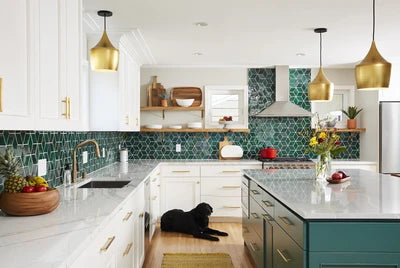
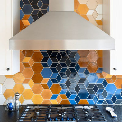
We are absolutely thrilled to share with you the new kitchen of designer Bari J. Ackerman. This maximalist kitchen is filled with pattern, color, texture, variation, and handmade tile! Continue reading to see how this beauty came to life.
Meet Bari J. & The (Old) Kitchen
We can’t say enough good things about our dear friend and visual mastermind, Bari J. Ackerman. Her unique lifestyle brand explodes with pattern and color in just about every way you can imagine including floral-filled fabric, stationery, wall paper, and home decor. We first worked with Bari to create her stunning bohemian kitchen with our 2”x6” Herringbone in 75 Emerald as the statement piece. It was with this initial project that we soon came to realize that the combination of our vibrant, handmade tile with her curated maximalist aesthetic were a match made in heaven.
Fast forward almost 4 years and the Ackerman family is making the move from Scottsdale, AZ to Charlotte, NC. How could we resist another collab with this pattern loving and color fanatic queen?!
For more on this stunning kitchen, visit our blog "Before & After: Bohemian Bluegrass Kitchen"

The Concept
When Bari told us she was moving across the country, we would be lying if we said we weren't a little sad. Her Bohemian emerald kitchen has become an Instagram icon and total statement piece in the design world. That feeling of holding on quickly disappeared as we, much like Bari, love a clean slate to get creative. For this home, Bari wanted to play with different patterns, colors, textures, and styles. She wanted wallpaper, natural wood, florals, golds, blacks, greens, and everything in between. She raises the question of
"Why do something that’s expected when you can go with the unexpected?"
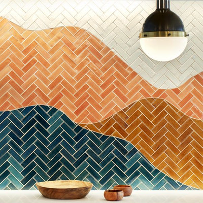
We're totally with you, Bari. For this kitchen, our female founder and color queen worked together with Bari to come up with the perfect tile. Herringbone was the obvious choice for shape. Bari fell in love with this signature pattern in her old kitchen so might as well carry on the her Herringbone tile legacy. It's also playful yet sophisticated and looks amazing when paired with a high variation glaze.
For more Bari J X Mercury Mosaics project, check out this Art Deco Bathroom!

On To The Next One
Remember when we said our 2"x6" Herringbone looks fabulous when paired with a high variation glaze? We think this Before & After collage proves just that. We absolutely adore Bari's choice to go with our 123R Patina glaze. It's full of magnificent detail, unexpected variation and a gorgeous range of hues, much like Bari's style. The earthy-red hues you see popping through these tiles are because we use this glaze color on a red clay body. We've gotten our glazes down to a science so we know just how they react on different clay bodies and this specific reaction is one of our favorites. Pair it with a Terra-Cota grout color and you've created a masterpiece!
For more on glaze variation, visit our blog "A Complete Guide to Handmade Tile Variation"
 2"x6" Herringbone - 123R Patina
Photography and Interior Design by Bari J.
The Final Results
The results are more magical than we ever could have imagined. It's whimsical yet sophisticated, rustic yet luxurious, Art Deco yet Craftsman and so much more. Hats off to Bari for always going above and beyond with maximalism. She says, "Things don’t have to “go together” to go together" and we couldn't agree more.
One thing we love about this kitchen is all the attention to detail when it comes to the tile. Looking closely, you'll notice 1"x6" edge glazed flat liners run along the Herringbone throughout the entire kitchen framing the pattern of the tile against the natural wood. The pops of earthy tones in the tile match perfectly with the terra-cotta grout. The floral wallpaper flawlessly supplement the spring greens in the tile. All in all, every detail is intentional and lovely.
For more on this kitchen, visit our Kitchen Gallery!


