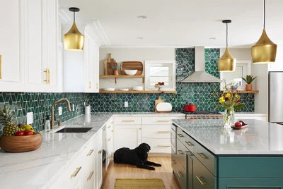
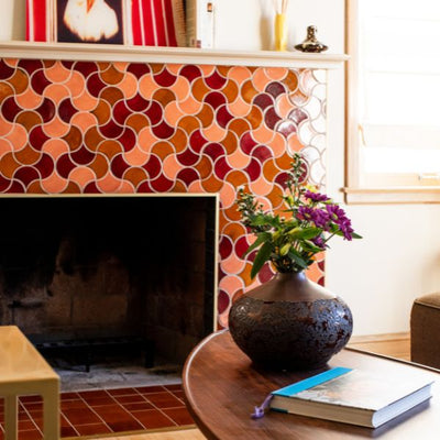
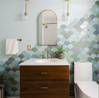
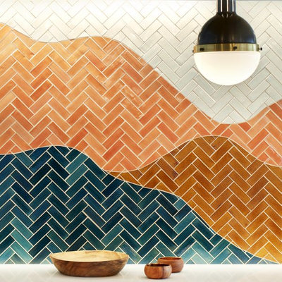
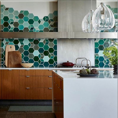
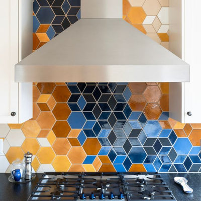
Grout is much more than the cement that fills the spaces between tiles - it's a crucial component to your project's overall design. It's common to wait until the last minute to choose your tile grout color, but taking time to consider your options may help your decision in the long-run. Here are 5 ways to pick the perfect tile grout color, considering the importance of grout choice on your overall aesthetic.
As an illustration of the impact that grout color can have, look at the example below. In the image, we have the same tile with a dark grey and a white grout. To see the difference, try covering one side with your hand or a piece of paper then swapping to cover the other side. You'll notice that the grout color effects the color of the glaze, the appearance of the shape and overall feel of the tile.

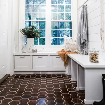
Large Hexagon - 47 Vermont Pine - Order Samples & Tile HERE!
1. The Perfect Match
When you choose tile in a monochromatic palette, having a matching tile grout color unifies the installation and creates more of a subtle design with texture like this wall of Bubbles. Browse our inspiration gallery to see if you begin to notice grout color in the various projects. Unless you design with tile all day like us, you've probably never considered this small detail. Once you become aware of a detail like this, you'll start to notice tile...and grout... in public spaces in a whole new way. (You're welcome - by the way). Anyone that works with us at Mercury Mosaics begins to notice tile in their everyday lives in a whole new light. :0)
 Bubbles - 11 Deco White - Order Samples & Tile HERE!
2. Be Unique - Complementary Color
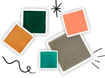
If you love to play with color and make unique design choices this is the option for you! Similar to the concept above, this combination is best considered in the earlier stages of your project. If there's a tile color you're in love with and you'd like to take the design a step further with a complimentary grout color, we're happy to make a recommendation. Order a color sample from us to see it in your own lighting. Here's a helpful link to view grout colors from our recommended brand, Laticrete. If you don't see the tile sample color you're looking for, please send us an email at sales@mercurymosaics.com.


3. Classic & Simple - Low Contrast
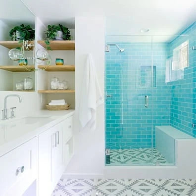
This classic look is the easiest to execute and lowest-risk. After purchasing your tile, find a grout with the most similar hue or lightness. Rather than looking for the perfect match, look for a slight contrast so you can see the tile's shape clearly without looking harsh.

 3"x6" Subway Tile - 815W Light Grey - Order Samples & Tile HERE!
4. Modern & Bold - High Contrast
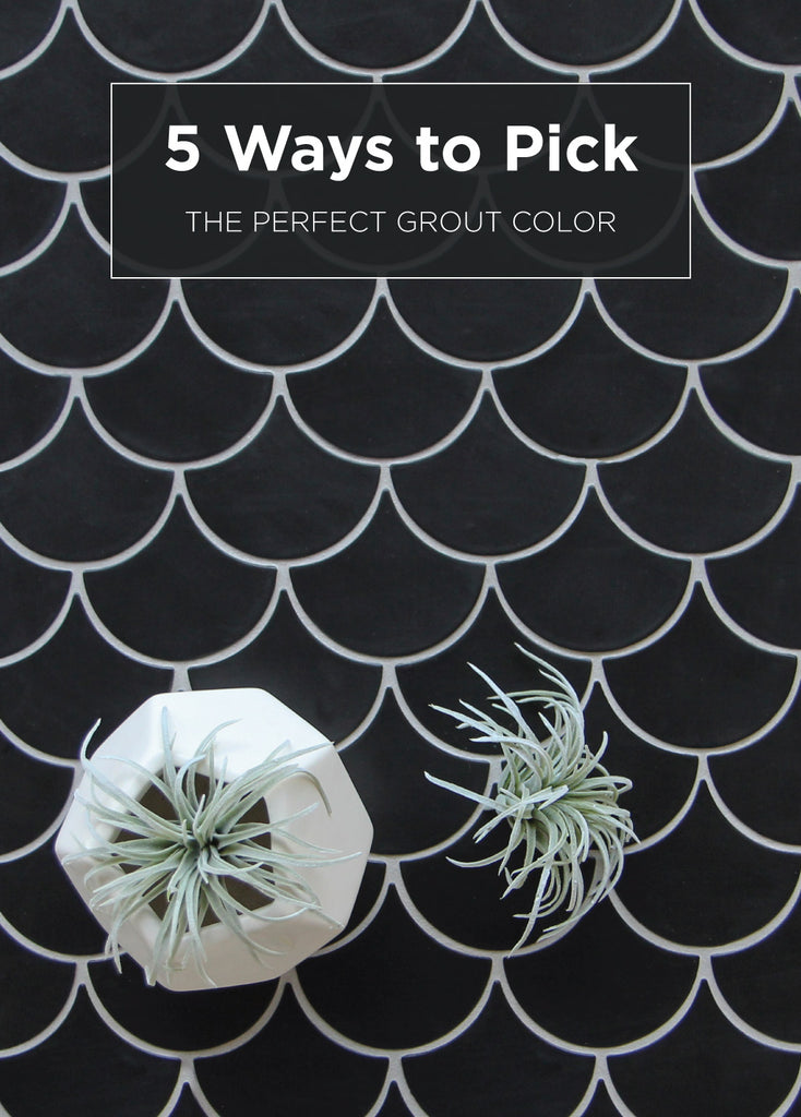
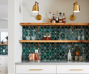
Choosing a high contrast for your grout helps create a sophisticated, modern, and geometric look to your tile. Determine whether you prefer dark grout with light tile or vice versa. Whatever grout colors you choose, going with a high contrast will help your tile installation pop!


Medium Moroccan Fish Scales - 366 Satin Black - Order Samples & Tile HERE!
5. Anything Goes - Bright Tile with White Grout
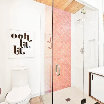
White grout is the little black dress for tile, anything goes. Any style, color, or shape goes well with this option. Sometimes easy is a good thing when you're choosing a grout color!


Order tile samples to see, touch, and fall in love with our handmade tiles in person. We would also love to hear what inspires you! Did our article help you figure out how to choose a grout color? Tell us more about your future project and get the ball rolling.
The post 5 Ways to Pick the Perfect Grout Color appeared first on Artisan Tile Company: Handmade Ceramic Tiles by Mercury Mosaics.


